
Production Design Practicum: Case 1017
This is the capstone project for the Columbia College Chicago film department. Every semester, four or five Practicum Films get produced by the college, each being given a budget of $5,000. Each of the film sub-departments gathers a class of five students, who then get grouped into five complete film crews.
For this project, I was the Production Designer. This meant that I was in charge of the visual storytelling in conjunction with the Director and Director of Photography. Countless hours of research, drafting, and execution went into the final product you see here.
More photos are on the way in addition to stills from the film footage. Please be patient and feel free to leave any feedback in the Contact page. Thank you.
Story Breakdown
A young prison psychiatrist must determine if his patient is safe and ready to be released for parole, while wrestling with many biases including his own.
This short film poses large questions: Are morals relative? Is truth relative? Can people change? Do the ends justify the means?
This short film poses large questions: Are morals relative? Is truth relative? Can people change? Do the ends justify the means?
Design Strategy
To convey the levels hidden throughout this film, I used several design themes:
Seen vs Unseen - Known vs Unknown - Conscious vs Unconscious
Trapped
Underlying bias
These themes will be expressed through visual elements and motifs:
Lots of meaningful set decoration placed to slowly reveal backstory
Strong vertical lines throughout
No clear windows or sightlines
Subtle introduction of red
Research and Inspiration
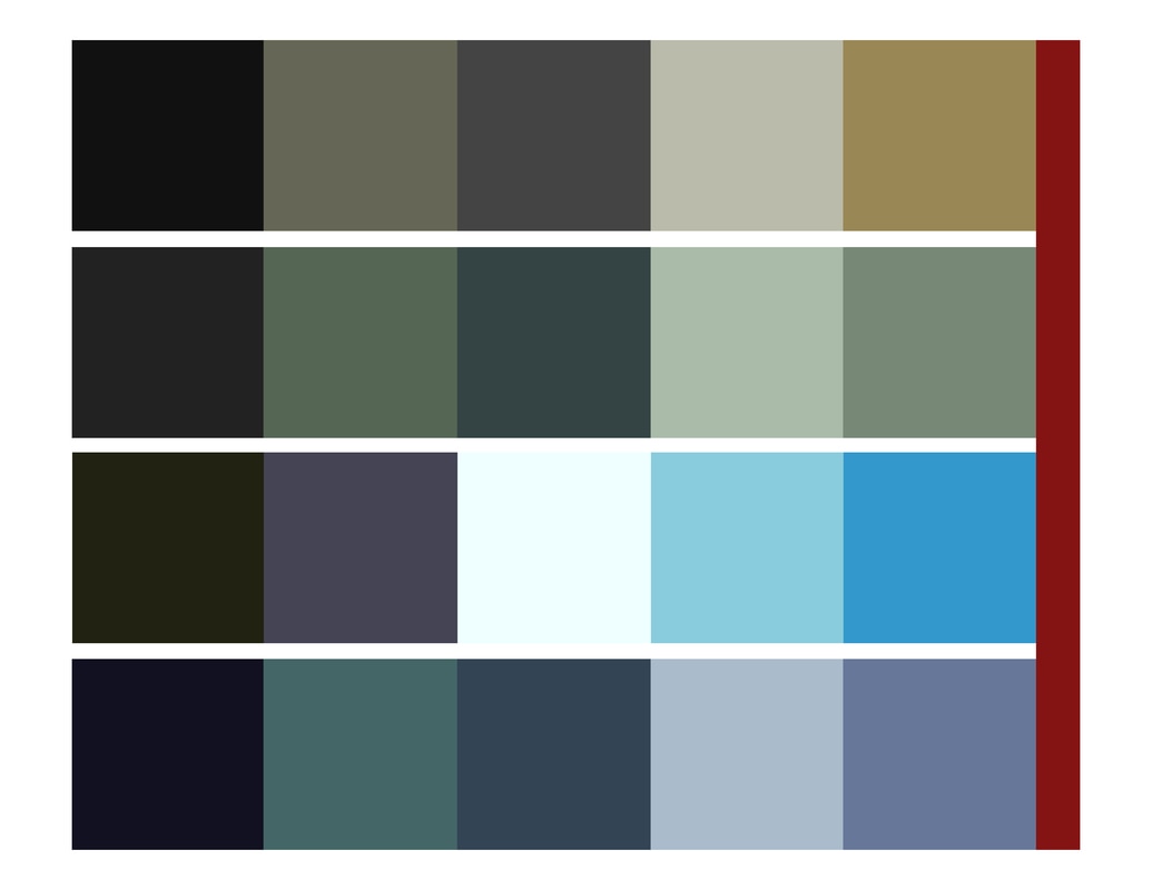
Color Palette
Inspiration
Much of my design inspiration comes from Tom McCullah's design in the film Starred Up, and Gary Baugh's design in the first season of the television series Prison Break. Additionally, I pulled from the use of high-contrast interiors and strong outlines like that of many styles of prison tattoos.


Warden's Office Research


Alex's Office Research


Visitation Room Research


Set Design
SketchUp Models
These sets were designed for both function and beauty. Working with a limited budget makes it difficult to create two entire sets. Therefore, I decided that it would be best to reuse the same walls and make a full flip in between shooting days. We had a six-hour turnaround time to transform the warden's office into Alex's office. To do this, we had the walls pre-painted before applying the custom wall panelling, as well as keeping the bottom section of paneling in both offices. Then, the sixteen-foot side wall was actually two eight-foot walls that became the two short walls for Alex's office.


Final Build: Warden's Office


Final Build: Alex's Office


Location Build: Visitation Room / Observation Room


I'm always looking to improve. If you have a minute to leave some feedback, I'd greatly appreciate it.
© 2018 Parker James Bradford
